I just received out local Las Vegas AIA publication (FOURM) for February and the cover article is from Randy Lavinge, Hon. AIA - Executive Director
Here is her first paragraph:
"What does that mean? 'The Architect as Legislator'? It means that in the fast-paced, ever-changing, cyber-uniworld we live in today, an architect cannot simply be a good designer. It means that architects can no longer afford to let someone else make decisions that define our communities and the practice of architecture. Architects must make a conscious effort to be more aware of... and more responsive to... the local, state and federal governmental agends and how they impact our communities. It means that architects need to get involved in the political process. They need to seek out and accept leadership roles in their communities, so that they can help to guide the policies and the decisions that shape our cities, our nation and our world."
Tonight I will scan in the rest of this article and post it to the 'Blackboard' for those of you that wish to read the rest of it.
1.30.2007
THE ARCHITECT AS LEGISLATOR
Posted by
Ken Ballard
at
12:24 PM
7
comments
![]()
Labels: Roles of the Architect
1.29.2007
Studio- Develop Signature Element
The "people mover"...
The central figure vi sable to all levels/layers of the store.
This space will weave inside and out of the store... each stop along the way providing for a different view...
What happens inside of the "people mover"?
What is the experience inside and outside of the "people mover"?
Will the experience inside be the same or different from the outside?
I want to exploit the working components of the "people mover", structure, culture, surroundings... How can this concept be explored into the rest of the store?
Is there a way to have the "people mover" open to the outside?
Some of my initial concepts of the space were:
-LAYERS-TOUCH-VISUAL-OPEN-SEAMLESS-CLEAN-FORMAL-MATERIAL
This "people mover" can address all of these ideas. The travel of the unit will penetrate all the layers. There will be visual clues of both the store and square that it fronts. The material (glass) can create openness, both visually and physical.
The elevator at the ICA provided me with inspiration and direction to follow in developing this element. The large scale of such an item can allow the elevator to be much more than just an elevator or "people mover", it can stand alone and also compliment its surroundings. The elevator used as a means of transportation from one level to the other is common and often not thought of anything else. Done right the "elevator" can set the mood/anticipation for what the destination will be.
On the outside looking in the experience is much different. At the ICA, every time I saw the elevator running I wanted to ride it again. Like a revolving canvas, each ride will provide a different, although similar experience.
At the Apple store it can be: buying the latest Apple invention, going to an event on the roof top gallery or plaza or heading out to the "observation deck" to people watch.

Posted by
Ken Ballard
at
8:36 PM
2
comments
![]()
Labels: Studio - Post-Intensive
WATERLESS NO-FLUSH URINALS
For all of you that thought I was losing my mind. I would like to introduce everyone to the "waterless urinals". This is a blurb from their web site Waterless Co.
link to the info video
cost benefits
specifications
Posted by
Ken Ballard
at
8:06 AM
1 comments
![]()
Labels: the green thumb
1.27.2007
Post Intensive Studio
I would like again to comment on the studio and the one week intensive studio. Like Rick said, "there is a lot to learn from 'fail fast'", to be able to make something fast, analysis, critic, and adjust can and has been extremely productive for me in the past. The week in Boston brought out that way of assessment and I am eager to follow those patterns again.
Most of the comments I received were paced on the model with the yellow sticky notes, and then some others on the pictures of the models, yet again with the yellow sticky notes. I was a little disappointed that no one took "sharpie to paper/model", oh well. The comments were still very thought provoking and addresses points that I had yet to think about or had thought about but hadn't completely resolved.
Notes from the models:
Note #1 - What is it about this public platform that makes me want to go there? Especially at night?
The concept/ideas surrounding the "public platform" is just that... for many years (the earlier years) the MAC (apple) was an underground sort-of cult following. Since the advent of the Ipod and its huge success, the Apple name has grown leaps and bounds. Apple's concept of late has been that the MAC is user friendly, the Ipod is a way to express yourself, etc, etc. The public platform is not only a physical place but a ideology concept where all users, and non-users can interact and share experiences, knowledge, friendship, etc, etc
Note #2 - The geometries are nice - how can they begin to break down at the smaller scale?
I am not sure that I want to break these into a small scale... I think they work well as they are, I feel that if these shapes start to appear all over the place in a "smaller" scale there can be a loss. I don't think that by bringing these geometries to a small scale it would enhance the feel.
Note #3 - Connection to Copley Square - Good start. Good idea.
Thank you... I originally was wanting to build below grade and only provide a glimpse of the store on the site... after visiting the site and getting some background of the square and what this store geographically would share its location with and what these other sites mean to the city and architecture as a whole, I wanted to start to bring Copley Square into the store as well as share the store with the square.
Note #4 - Can the top of your angle piece be a light shooting out into the sky?
I am not to sure about that... this site does not scream out the "Luxor", if in Vegas, maybe... But I am not to sure about how that would fit into a historical area like Copley Square.
Note #5 - What is the direct/implied connection between the roof and the front patio? Can it take a more direct route rather than underneath?
The connection between the roof and the patio is all about the people... this site, this store is more than a "retail" location, it is about people movement (as I mentioned earlier, a place for all users to mingle). A tourist attraction as much as a "locals" hang out. I would equate it like this... locals = MAC users and tourists = Ipod users; all coming together at one location. As far as a direct route... sure... How? that is something I will explore as i further the concept/design. I like the thought that there is some inter connectivity between the store, the outside areas and the roof top.
Note #6 - The public space could be nice... How would you get me there if I were a PC user?
Ahh the other 95%... great question! this is where the genies of apple can shine. Apple has already started this type of thinking... the invent of the Ipod without the connectivity to the PC world would have been a quick death. How ever apple teamed up with HP to make things work... I would assume that the large amount Ipod users are also PC users. A quick survey of my cohorts in the study showed only one MAC user among us... yet I would say nearly half of use had an Ipod. Back to the question... I use an Ipod, I don't use a MAC.... being at this "Public Platform" and being emerged in the Apple products (much more than i would be using my Ipod at home or in the office) I feel that the consumer (me) would venture to see the other products...
Notes from the images:
Chris, I was originally thinking that the "people mover" would be the connection between the public spaces. Access to the top level, also a public space, would be by invite only.... The invite only idea doesn't really work well with Apple's concepts or show connection to the Copley Square, a public space. The addition of the stairs would be two-fold: there would be public access to the "events" as well as a great upper plaza and I can see this "path" as an amphitheater to Copley square, a place where people watching can take place. This transition from public space to public space, from the vantage point from inside the store, would be wild, not to mention that the intended use of these "places" would also happen on the way to each one. Great point!!!
I agree with the "need" for the a clearer path... I, with the points made from the previous comment and reply will be able to expand on that.
Paul, I think you hit the nail right on the head! The ability to attract/keep people on the site, both during the day (store hours) and at night (after hours) is crucial to the success of mixed-use projects. Although there is no residential use in this program, maybe there is a need for residential at this corner? In any case, from what I saw during the night hours (after hours) there is still a high number of people that walk in the area going from here to there. I feel that if there is a reason (public space, art gallery, restaurant, night club, etc) this would then become a destination spot for the night life.
I think I hit on this point with the previous statement about wanting to create a place of destination by providing a space for an art gallery, restaurant, night club, etc. I like these comments because I feel that I got across the notion of what I would like the place to feel, now the questions are.... what will it be?
Ahh, the best description I could give at this point is... it would be like a sidewalk cafe area for consumers of the store as well as any person wanting to take a break from getting from A to B to come up to an elevated seating area to do what is usually done at any sidewalk cafe seating area would allow: people watching, meeting friends, have lunch, conduct a meeting, etc, etc.
I would imagine that Apple would be all over this... As Paul mentioned, "more people + Apple = more $$." Not only would there be more people on the site for longer hours, I can foresee people wanting to have receptions, weddings, art shows (revolving displays) lectures (during the "good" weather) as well as many others uses that will just happen as the "place" evolves on the roof/terrace.
The concept of the layers does not need to be as literal as " one set of rules stacked on another set of rules", rather I saw layers in the way the store was laid out... first there was this, then there was that to use with this, and then there was this to use with that to help use this. I wanted, and I think was successful, in that as the consumer shops there would be a visual link to the next item that he/she will need to have/want to make their MAC using experience better/easier. An example would be, as you are browsing the Power books you can see past that and start to get a glimpse of the software or the accessories that will make the experience better. I, personally shop like this, not necessarily having the visual connection to the "add-ons" but in my head I am thinking ahead to what else I can get for the product to use with it. I would like to bring in the visual aspect of this brain thought to the shopping experience. This will not only keep the brain thinking ahead for the next purchase, but allow the shopper to visually pick out the next product.
Posted by
Ken Ballard
at
6:45 PM
2
comments
![]()
Labels: Studio - Post-Intensive
1.23.2007
History/Theory - Week 3 .... 4
(some of the major points from the Thursday assignment)
Why Help?
- I am looking at a exploring the possibility of introducing a homeless "city" into Las Vegas
- How can I look at the model of this homeless city in Portland, OR. and implement the principles and goals of their community into Las Vegas, NV?
- A place with rules without the social mandates of the city homeless shelters?
- Provide a sense of belonging... a fresh introduction back into the main stream "society". A sort of "halfway" house/place for the "bums", "vagrants", "undesirables", etc...
- implement the Portland model into the Vegas Valley
- re"architect" the components that I see as "Hurdles" in the process of assisting a process for a communal distortion of "RECIPROCITY"
FORESEEN ISSUES:
- Location
- Value
- Participation
- Favor/support/interest
- Education
- City ordinances
Karrick wrote:
- Overarching goal is the Architect not only as designer, but a mediator of social differences
- What makes "undesirable"? What makes transitional? What is the root problem? Many studies have been done on the homeless (in) D.C. in the late 70's? bought homeless people bus tickets to anywhere they wanted to go. Can a shanty town be desirable? What other buildings house the homeless. Search Single residential Occupancy (SRO) - Chicago, Columbus. The commons at grant.
Anne wrote:
- How could you (I) involve others like you (me) in the process? You could even improve on the model in Portland by involving the community as a whole: fundraising and volunteering. It would be key to get businesses, educators, etc on board. Can you (I) teach those who want to learn? Yes. Can people who want to work, work? Yes. How could you (I) convince others to take a chance on these people's future? How can you (I) began to educate people about the benefits of helping others.
How?
Posted by
Ken Ballard
at
8:35 PM
5
comments
![]()
Labels: History/Theory
1.15.2007
Boston...
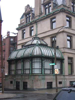
This is the BAC building... this was done in the same time period as the SALK INSTITUTE. This building was highly acclaimed during that time.
Posted by
Ken Ballard
at
4:13 PM
0
comments
![]()
Labels: Intensive Studio
1.14.2007
Intensive Studio...


more info later....
Posted by
Ken Ballard
at
8:29 PM
0
comments
![]()
Labels: Intensive Studio
1.12.2007
Bewildered and excited...
This last assignment seemed a slam dunk, yet I found myself fighting with myself... I get it, or at least i thing I do, draw a plan... draw a section... I wounder if I chose a poor image to further explore... It appears to be a straight on shot... the only activity or interest is focused directly center.... Essentially it is a box in a box.
It is safe to say that I look forward to getting to the BAC and having a face to face conversation about this one...
I also think that I can have a bad case of ... if it 'quacks' like a duck, swims like a duck and smells like a duck... it must be a duck. Having a diverse pool of academia this week and concentrating on thinking in ways that I may have set aside is good for me. I hope to get a broader sense that there is more than way to solve the problem.....
Once again looking forward to this week and all the challenges, experiences, and classmates.instructors.
Posted by
Ken Ballard
at
7:13 PM
3
comments
![]()
Labels: Intensive Studio
Assignment - 2 cont.
After looking at this shot again, I recognize that this is no "real" ceiling, rather a perceived ceiling or rather where the set ends. The awnings along the back wall provide the eye, aka the viewer and possibly the cast members the illusion that the "space" ends here. These new images provide, probably a better sense of the space as perceived by the viewer.


Scheme 2


Posted by
Ken Ballard
at
6:20 PM
1 comments
![]()
Labels: Intensive Studio
Why We Buy or the handbook for successful profits
After reading most of the book, I look forward to the rest of it while on the plane ride into Boston. The examples Underhill offers as the first steps towards effective marketing are the what the majority of the shop owners lack. The insight to locate the displays with the consumer in mind, not just the how the display looks in the store before the doors are opened. Simple suggestions such as move the "Top Ten" list lower, put the display away from the counter as to not block it while customers are in line, and designate a "space" for the queue to start.
While at UNLV I had the opportunity to work in retail at a "Western Wear" store here in Vegas, which has paid off, I still get a great discount, haven't missed a year of the PBR, NFR and get some concerts tickets still.... anyways, I remember that when a new display came from corporate arrived, it was up to us to figure out where it should go. The goal was always to have it in the most "trafficked" (sp) space, which usually is always near the entrance/cash wraps. It never failed that the next day we were moving it to another location because it affected the way we and the customers navigated around it. These displays are sent to stores with the intent that it will provoke the customer to buy that product, instead they seem to be in the way or forgotten. Enclosed with the display are always instructions of how it is to go together but never how to make effective. I can imagine the thought process.... okay, now that we have it together.... where should it go.... Where is should go is the most important piece of information that it should come with. I would equate it this way... not knowing where best to put the display is like driving to a undisclosed location with hopes to finding it without any troubles.
This book should, if not already, be on the "must read" list of every shop owner/manager when opening/operating a store. Underhill describes very well things that everyone should pick up on(among the other not so obvious), instead someone is to busy with a ton of things on the "to do" list that the obvious is just forgotten or over looked.
Posted by
Ken Ballard
at
12:22 PM
1 comments
![]()
Labels: History/Theory
1.11.2007
Assignment-2
I have put image 4 to plan and section. Below is a plan and section of the outdoor "living"space:

 ......................................................Section - 1

Posted by
Ken Ballard
at
9:19 PM
3
comments
![]()
Labels: Assignment-2
1.07.2007
Assignment - 1 (re-posted)
1. Many studies linking colors and moods have given insight and direction to many professions. Here we can see the gray of the cabinets and flooring create an atmosphere where a calm, civilized conversation takes place.

2. The stark contrast of calmness and business is almost lost when there is context. The context here is the sleeping cast member. Usually, when two conflicting concepts are joined into one frame one of the two is more dominant. The image to the left is perceived calmness and the image to the right, with the context removed, is very busy, drawing the eye all over the place.

3. The order of space and its spatial cohorts can be a very powerful device in how the human element interacts. There are clear and perceived boundaries within how this patio furniture is configured. As we have been discussing the Brickford's essay, it has become clear to me that the issues brought up are part of everyday life and different "people groups" can have very different perceptions of the same physical space.
 The "user" areas are defined in red, the yellow indicates a larger area that is meant for a social gathering/sense of comfort to be used by all cast members, the green indicates the perceived boundaries while blue physically defines obstacles (gates). Even though the open feel of the space is meant to encourage openness, free discussion and honest communication, there are still boundaries.
4. "Exterior Living" space, probably the most used s
 pace of the entire set, other than the maybe the bedrooms provides many levels of comfort, feel and use. Much like the previous screen shot there are common elements between the "levels" of this screen shot and the defined spaces and sense as discussed in the Brickford essay. Layered levels of materials are stacked upon each other. First I explored the "hard" surfaces, as indicated in the blue color group. I found what I could define as hard, then the soft. I thought that there would be some constant character that I would group together, no. What I found was that in each defined corner there was pattern. the same type of surfaces stacked on on the other. Fire pit on raised concrete patio, on concrete patio... billiards table on raised concrete patio on concrete patio. In the other direction there was layers of
 soft on soft, as indicated with the green "color group." Pillows on recliner on grass, pillows on pillows on couch. The Spa is a great example of a mixture of the two - soft and hard. This can represent what Susan was talking about, a mixture of the hard (public area) and soft (private area) co-existing in the same built environment.
Also the frame shows an example of the human element co-existing in the "hard" and "soft" environment sharing a game of billiards. As well as where the "soft" and "hard" are directly interacting, the couch on the concrete raised concrete patio. The most interesting part of this frame for me was (and I don't know this for sure) is that baby steps were taken, most likely as the "house guests" first were introduced to each other. First, there is human interaction, one on the "soft" surface the other on the "hard" surface sharing a common element. Then I would presume that after the idea of having "diversity" in such a small area the interaction started to take place in a common area, what all cast members (people groups) could call a private area (the soft surfaces).
Adapting to the diversity the final diagram indicates "people groups" can be in a public area and welcome others into a private area.

Posted by
Ken Ballard
at
10:38 AM
9
comments
![]()
Labels: Assignment-1
Fun Links
- The American Institute of Architects
- AIA Las Vegas
- Suzana Rutar, Architect
- IECC COMcheck-web
- LA Dodgers
- Things to read
- Drivers, start your engines...
- Science is COOL!!!
- The City Tower
- Slovenian World Confrence - Architects and Builders from Slovenia and the World
- architectural studies library UNLV
- ASL Blog
- UNLV Bridge Studio


